Official Graphics Comments & Criticism

new avy? made while screwing around.

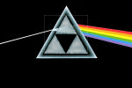
Darksideofzelda.png
 
Light wouldn't bend behind the triforce. Make the wave lengths actually come out of the triforce and the idea actually works. Basically, try to pay more attention to laws of physics when ripping images from classic rock bands...
:rolleyes:
 
lawl.... I'm working on it right now. I took a picture of the album, took a triforce. Rendered it, stuck it on. LOL

Pink Floyd is great! Zelda is great! Merge them, and you get too much greatness for one avatar.

Edit: changed, just for you. All I did was take out the light refracting through the left side, as well as going out the right side:

dsott-1.png


also centered it.
 
Last edited:
ATTENTION:

Could someone here make the background for this picture a dark red but keep everything else the same. Thankyou.

untitled1pu0.jpg


EDIT: And you can make the text white!
 
Last edited:
Bumping Post:

ATTENTION:

Could someone here make the background for this picture a dark red but keep everything else the same. Thankyou.

untitled1pu0.jpg


EDIT: And you can make the text white!
 
This took me all dam night >.<

I spent ages on animations.

I spent ages on renders.

But its now just plain and simple techyness.

 
  • Thread Starter
  • Thread starter
  • #880
Cpt.McCloud said:
This took me all dam night >.<

I spent ages on animations.

I spent ages on renders.

But its now just plain and simple techyness.

Go enter it before you go to bed. :]
 
demonflair said:
Definitely the second one is the best one :)

For improvements in the second sig, first you need to add contrast to the renders and bg, also some lightings, I see you have three renders in the bg... if I were you, I would play with them, using filters, some glass, displace, noise, blurs, wind, and so many other things... also add blending options in those renders, keep in mind that the main render, the centered one, needs to be the most visible and noticed, for that, move the left one a bit to the corner, make it a little bit small (maybe the same size as the other render in the bg) and then make the centered one much bigger...


You will find a thread by Brawny in the Design Lounge that has good GIMP tutorials.

I hope that you work a little bit in the second sig, because that was a really good one :]
Uhmm you just confused me past the point where I can think straight. Oh well I'll look it all up but now I have to lift myself back to a B in Language Arts. 8th grade and they have a highschool science teacher who hates me teach the most important part of LA: Creative Writing.....whyyyyy?! I'll get to work in my free time.
 
@Brawny: That's a great GIF, but make it a liitle bit slower and it will be much better. :yesnod:
 

Latest posts

Back
Top