tarheelsuperman
...it gonna be zoppity
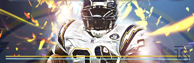
Here are a couple of Sports Sigs I've made.

Follow along with the video below to see how to install our site as a web app on your home screen.
Note: This feature may not be available in some browsers.
tarheelsuperman said:Here are a couple of Sports Sigs I've made.


They look good, but both the renders appear to be kind of dark (especially in the second one). But they are both very nice overall.Popert said:These are my latest sigs just finished them last night...
1st:
2nd:
Please comment...
tarheelsuperman said:Here are a couple of Sports Sigs I've made.

Monsteroids said:
:scared: yeah C&C I s'pose.
C&C my avy while you're at it!
demonflair said:Render far from to blended..
Bg is plain and flat.
Blue overlayed border looks horrible.
No text.
2.5/10
Avy - 5/10
Monsteroids said:Bold 1. What does that mean?
Bold 2. That counts???
Bold 3. Anyone have an analysis? :/
I get what you mean about the bg, I just have no clue what to do about it.
I'll get rid of the border sir!
There's no depth (meaning it looks flat)Monsteroids said:
demonflair said:Bwuahahah
Ok, I'll explain.
Bold 1.The render has a weird effect in his left side, it's a bad effect and it just makes the render with low quality.
Bold 2. To me counts, it's part of the art
Bold 3. Does it need one??
Gymdawg said:Not all sigs need text.
Gymdawg said:Probably not. I don't feel like making a death sig today.