Why is the game art so simple?

It's not really an issue for me, but I agree Nintendo's box art is usually rather dull. I presume Nintendo apply their "substance over style" philosophy to their box art as well as the in-game graphics. It probably comes down to the publishers though- they use different artists who follow their own styles, so some covers will look better than others. For an example of good artwork, I think the European cover for Resident Evil 4 looks superb:
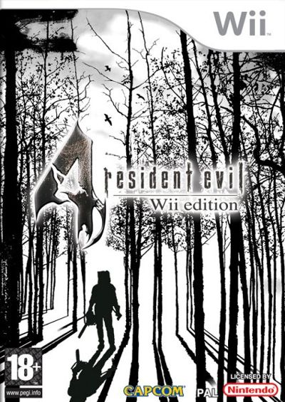
re4wiibox.jpg
 
I compiled a list of images to give an idea of what the MAJORITY of box art looks like. There is a common theme, a consistancy that appears over and over. It merely enforces the idea of the kiddie image nintendo has, even if the games themselves might not be kiddie.

Basically there is a lack of variety.

wiiboxartfc0.jpg
 
I like some of the boxart like strikers I think looks really good. Oh and I wonder what that shin chan game is like.
 
i agree, i think they did a great job on the mario strikers art. Its wierd though, it has an urban streets style to it with gang style font.
 
i think its to attract the younger generation as bold simple colours always stick out thats why the games attract me as i enjoy bold colours they always catch my eye.
 
  • Thread Starter
  • Thread starter
  • #25
To everyone:
I was talking about the art on the game itself. Not the box. I think the box art used on all wii games are amazing.
 
Shiftfallout said:
i agree, i think they did a great job on the mario strikers art. Its wierd though, it has an urban streets style to it with gang style font.

What gang would that be? The lollipop gang?
 

Latest posts

Back
Top